29 March 2014

How to Use Colour Effectively in Presentations

In my previous post I introduced some Colour Theory concepts. We've learnt the difference between hue, value and saturation as well as some basic colour combinations derived from the colour wheel: monochromatic, analogous and complementary. Today I'd like to show you how to apply these concepts in your next presentation.   

Professional presentation designers don't choose colours randomly. Rather, they create a colour pallet. The good news is you don't have to be a professional designer to be able to create your own colour pallet. A smart and easy solution is to pick up the actual colours of an image. And you can do that directly on your presentation software, like PowerPoint or Keynote. 


Photo credit: Snurb via Flickr
Say for example you are asked to make a presentation on the Green Economy. In order to give your slides a consistent look, you may want to start from a photo related to the main theme, like this wind farm on the right. 

Then, when it comes to choosing a colour for the text you want to combine the image with, instead of picking it up randomnly you can select exactly the colour you are looking for. To do that, you need to click the colour picker on the desired area of the image. In the example below I wanted the word "green" to be of the same colour as the grass in the wind farm. This technique could also be useful in a business presentation, where you can extract the real colour of your company logo and use it throughout your slides. Do not choose a similar or "close enough" colour, choose the same colour. Then, if necessary, you can adjust the value and make it lighter or darker for a better contrast. 


You can also work with free online resources to create a colour pallet which is appropriate for the theme of your presentation. My favourite is Kuler, a web-based tool from Adobe. The way Kuler works is straightforward. It allows you to upload the photo you want to create a colour pallet from and automatically picks up the relevant colours from it. If you are not happy with the default choice, you can move the sliders onto a different area of the image to pick up different colours. As you can see here, the result is immediate. You have created your own colour pallet to be used throughout your presentation; a colour pallet which is consistent with the main theme: the green economy. 


A nice thing is that by selecting the colour wheel at the top right you know exactly which colours Kuler created for you. For example, the green at the centre is 53, 65, 15. It's that simple!


I always use Kuler for my presentations. As you can see for this chart I didn't choose a random green, I chose exactly that green at the centre. I have only made it a bit lighter to increase the contrast with the dark background. 


Kuler is so cool to automatically create colour schemes for you. This means that you don't have to be an expert to choose the right colour combinations. Kuler allows you to select the colour scheme you want to use, be it analogous, monochromatic, complementary, etc. Of course having at least a general understanding of Colour Theory is useful. However, Kuler makes it easier.

1 March 2014

Colour Basics: Introduction to Colour Theory


Let’s face it, whether you like it it or not, the colours you choose and the way you use them have a profound impact on the effectiveness of your visual message. Colours can be used to achieve many objectives. You may want to evoke emotions, to emphasise, to get attention and so on. You don’t want your audience to bark up the wrong tree because of your misuse of colours. That is why it is important to understand the basic principles of colour theory.


COLOUR THEORY

The three main concepts you need to be familiar with are hue, value and saturation.


Hue
The hue is the pure colour. Every time you mention a colour (e.g red, blue), you are referring to the hue. In this version of the colour wheel, the hue is four steps from the outside (or from the inside). As you move out more black is added to the pure colour (shade). As you move in you get a higher percentage of white added (tint). 


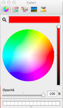
Presentation software tools like PowerPoint or Keynote allow you to work with a colour wheel which is derived from the traditional one. You can choose a pure colour (hue) by putting your cursor at the outermost section of the colour wheel. If you want to get a lighter tint you can move the cursor toward the centre of the wheel. By scrolling down the slider on the right of the wheel you get a darker shade of the hue.
Value
When you adjust the tint, you are adding more white to the hue getting a lighter value. When you adjust the shade, you are adding more black to the hue which becomes of a darker value. 


Here the background colour is a classic blue. In the slides below the background value has been adjusted. 

The background colour of the slide on the left is a darker shade of the original. 
On the right you have a lighter tint.


Saturation
Saturation is the relative brightness or dullness of the hue. In the example below, the photo on the left has a relatively high level of saturation. The version on the right has less saturation, getting closer to grey.

Photos by Asher Photography Studios

You can make your visuals look better by using only three basic colour combinations based on the colour wheel: monochromatic, analogous and complementary. In reality there are more than three options, yet working with these three combinations will significantly improve your design and give it a professional look. 


Monochromatic
A monochromatic scheme uses only one colour (hue) in different shades and tints or at different levels of saturation.

Both slides use only one hue (plus white) in three different tints or shades.


Analogous
Analogous colours sit next to each other on the colour wheel. 

This slide uses three hues (plus white). They look similar due to their proximity on the colour wheel. One of the hues has been used to make one of the elements pop out. 


Complementary
Complementary colours are opposite colours. They sit across from each other on the colour wheel.

Complementary colours create a strong visual impact.

“Colour used well can enhance and beautify, but colour used poorly can be worse than no colour at all.”  
- Maureen C. Stone, author of A Field Guide to Digital Colour
 As a takeaway lesson I'd like to stress two points, especially for the beginners:
  • Never use more colours when less do the job well
  • Use colour for a reason 
Have you ever thought why traffic lights use red and green? Apart from the fact that common sense makes us associate red with risk (stop) and green with safety (go), red and green sit across from each other on the colour wheel. In order to give colours opposite meanings we chose opposite colours. Next time you create a presentation, think carefully about the colours you choose and make sure nothing is left to chance.  

Now that you know the basics of colour theory we can move on and learn how to work with colours to create slides that rock. But this is something I will write about in my next post. Also, I will soon introduce a very cool tool, so stay tuned. 


Most ideas in this article have been gathered through the books Presentation Zen by Garr Reynolds and slide:ology by Nancy Duarte.