22 December 2014

How to Make a Business Pitch the Pixar Way

Since Pixar made its first feature-lenght film in 1995—Toy Story—it has been capturing people’s imagination with incredible films like Monsters Inc., Finding Nemo, and Up. Not only has Pixar become famous for making the first computer-animated film ever (Toy Story), but also for its brilliant storytelling techniques.

I’ve recently stumbled across this article highlighting the 22 rules of storytelling according to Pixar. The idea came from former Pixar story artist Emma Coats who tweeted about what she had learnt during her time working at the animation film studio.

Among many of the Emma’s gems for telling a great story, here’s to me the essence of Pixar's storytelling:

Once upon a time there was ______. Every day, ______. One day ______. Because of that, ______. Because of that, ______. Until finally ______.


Drawing from a Bloop Animations’s video examing Pixar's storytelling rules, Caroline Siede wrote that “all Pixar films (and most good films in general) center on a call to adventure that pulls a hero from his comfortable world to a new, unfamiliar one. In Toy Story, Woody must learn to live in a world in which he isn’t Andy’s favourite toy when Buzz arrives. In Finding Nemo, Marlin must cross an entire ocean to find his abducted son. […] Watching a character react, fight, and grow in his new surroundings is what makes these Pixar films so compelling.” 


As counterintuitive as this may seem, you can apply this storytelling formula to your business presentations too. In fact, not only is this something you can apply to business pitches, it's actually something you should do if you want to make them memorable.

If you think about it, this rule goes hand in hand with the old Aristotle’s three-act structure, a storytelling technique not only used in movies, but also in writing and in many other art forms built around a story. And a presentation is an art form built around a story. [Tweet this] The three-act structure splits a narrative into three parts:

  • Set up
  • Confrontation
  • Resolution
Here's how Aristotle's three-act structure and Pixar's storytelling rule come together.
  • Set up: Once upon a time there was ______. Every day, ______. One day ______.
  • Confrontation: Because of that, ______. Because of that, ______.
  • Resolution: Until finally ______.
Now let’s see how you can use Aristotle in your business pitch.

Set up

At the beginning of your presentation you should describe the world as it is without your idea, product, service, etc. (
Once upon a time there was ______. Every day, ______). Your audience will be with you because you are describing something they are familiar with. Then, pose a problem that changes their perspective (One day ______). If you are pitching to a customer, highlight a problem they have that you can solve. By doing that, you are creating a gap in your customer’s mind between the world as it is today and the world as it could be tomorrow if there was a solution to their problem. This is your call to adventure that pulls your hero (your audience) from their comfortable world to a new, unfamiliar one.

Confrontation

During the second part of your pitch, you should be playing with the gap you’ve created previously. Give concrete examples of what your audience’s world looks like with such a problem and what it could look like if you had a solution (
Because of that, ______. Because of that, ______). It’s crucial not to reveal your solution at this stage. Remember, Marlin had to cross an entire ocean to find Nemo. 

Resolution
 

Until finally ______. This is the right time to reveal your idea, product, or service. By going through the three steps, you’ve not only created a gap in people’s minds, but you’ve also built on a desire to see that gap being filled. Once you do fill it up with your solution, they will be more inclined to accept it.  

Like these ideas? Meet me over on Twitter or Google+ to start the conversation right now!

IMAGE: iMERICA

2 December 2014

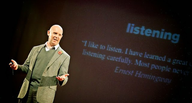
The Ultimate Guide To Speaking So That People Want To Listen

Estimated reading time: 3 minutes, 30 seconds 

In this article I'll share with you:
  • The ultimate guide to speaking so that people want to listen
  • My humble opinion on this topic 
  • An example from a personal experience that can teach us something about communication  
Julian Treasure’s ultimate guide to speaking so that people want to listen

In this TED talk, Julian Treasure—a sought-after international speaker—offers up seven things effective communicators must not do and as well as four elements every great speaker should master.


Here are the don’ts:
  • Gossip: “We know perfectly well the person gossiping five minutes later will be gossiping about us”, says Julian 
  • Judging: “It's very hard to listen to somebody if you know that you're being judged.” 
  • Negativity: It’s also very hard to listen to negative people, those who always see the glass half empty 
  • Complaining: See above
  • Excuses: It’s hard to listen to somebody who never takes responsibility for his own actions, but rather blame others. Worst case is when people blame others for failures and praise themselves for achievements
  • Lying: Who likes layers? 
  • Dogmatism: “The confusion of facts with opinions.
And here are the do’s:
  • Honesty: Be clear and straight 
  • Authenticity: Be yourself  
  • Integrity: Be your word 
  • Love: Wish them well
Julian’s talk is full of great insights. If you’d like to find out more about his ideas, I do suggest that you watch the video above. He truly knows what he’s talking about. 

My humble opinion  

We are flooded by tips and tricks on how to get better at communicating our ideas. And it’s fine because the power of the spoken word is huge. This is not only relevant to TED speakers or international speakers. It’s valid in business, education, family life, etc. I can’t think of any aspect of our lives where the ability to effectively share one’s ideas is not relevant. However, I also think sometimes we dive into too many details. So I thought I’d do many of you a favour if I narrow the Julian’s list of do’s and don’ts to one main concept. 

The one piece of advice that matters the most is authenticity. None of the Julian’s lessons work if you are not authentic—if you are not yourself. You may be good at not judging, at being positive, you may be honest, but ultimately being yourself is preparatory for all the rest. In Carmine Gallo’s latest book Talk Like TED, I’ve found the best communication lesson ever: “Stay in your lane.” Carmine says we shouldn't pretend to be Ken Robinson, or Steve Jobs, or Hans Rosling. We can (and should) learn from them, but we need to follow our path and become the best representation of ourselves that we can possibly be. [Tweet this]  

My personal experience 

A couple of weeks ago I shared on Facebook a photo of my girlfriend which has a lot of meaning for both me and her. A little bit of background. I live in England, she lives in Italy, so you can imagine how rarely we see each other. We’ve recently spent together a nice long weekend in the Venice of the North: the lovely Amsterdam. On our last day we went to the airport and had to say goodbye before the security checks because we were assigned two different gates. Our goodbyes always come with some tears—it’s all inclusive. After an hour, though, she unexpectedly appeared again right on the other side of my gate, so we could see each other for one more minute. I couldn't not share that meaningful moment. 
This photo got about 130 likes. For someone who’s not Guy Kawasaki, it was an all-time record. Why do you think many of my friends liked it? I believe the main reason is that we’ve been authentic. We haven’t been afraid to show who we really are. We shared our story with no barriers. People are naturally drawn to things that are transparent and authentic. 

This is not a lesson in social media, it’s something you can apply anywhere. In your next presentation, in a meeting with your boss, in a job interview, in the relationship with your friends, authenticity is key. Stay in your lane and be the best representation of yourself that you can possibly be.   

IMAGE: TEDxYouth@Manchester via Flickr

16 November 2014

One PowerPoint Secret That Will Drastically Improve Your Presentations

Estimated reading time: 4 min
A few days ago a friend of mine asked me to check a presentation he made for a meeting with one of his customers. He works for a London-based company which carries out market research for other businesses that are interested in certain information. He had to present the research findings to a client and asked me for a feedback on his deck. Because the slides he used were rather cluttered with unnecessary elements, I suggested that he made them more visual. He said: “Andrea, I know our presentations should be more visual, but we have a problem: our customers want to see the results of our research—they want to see the data, the numbers, the hard stuff. If we make visual presentations, then we would need to prepare another document as a handout and we don’t have time for that.”  

I understand his point. Businesses don’t have much time to spend on creating both a nice presentation and a document for future reference—and most likely they don’t have the foresight to hire a presentation specialist to do the work for them. But the good news is, there is a solution. 

By reading this article you’ll learn how to create visual presentations that at the same time include as much information as you like (seriously!), without doing extra work.

I usually don’t write about presentation tools and their features because what matters is the approach you follow. If you get the approach right, it doesn’t matter which tool you use. [Tweet this] In this short clip John Lasseter—Chief Creative Officer at Pixar—gives an important piece of advice to inspiring animation students:


“…Through your career the software will change, what’s important is […] what you do with the software. And what you do with the software...you’ll learn that from the basic fundamentals 
(drawing, design, film grammar, story, etc.).” 

Design, storytelling, public speaking, visual communication: these are the basic fundamentals that matter when it comes to presentations, not the software. However, I’ll make an exception today. There is one feature presentation tools have which can really set your presentation apart: the Notes Page view. Most people don’t know it, or don’t use it at its full potential. I’m going to show you how it works in PowerPoint, but the idea is exactly the same with Keynote. 

The Notes Page View

If you pull down the View” menu and click “Notes Page”, voilà, you’ll see your slide on the top and a text box on the bottom. Whatever you write in that text box won’t be seen by your audience when you are in Presentation View. What I find nice about this box is that you can use it to display any kind of information: text, charts, tables, images, etc.—the sky’s the limit! What’s even better is that it’s extremely easy to place and move objects within the box. It’s as easy as it is to move elements within a slide. You can even customise the position of the text box and of the slide and change their size as well.  

Here’s a screenshot of the Notes Page view (my PowerPoint is in Italian, but you’ll find this button on the same position, regardless of the language).

If you think about it, this feature can improve your presentations—and your customer’s satisfaction—by making your slides breath. It allows you to create simple visuals that amplify your message during your meeting and—with no extra work—a follow-up document with all the additional information you want your customers to take away. The only difference for you is that instead of cluttering your slides with loads of text nobody will read, you can put everything in the text box on the bottom, save it as a pdf and print it or email it to your customer. Without even realizing it, you are creating both a nice presentation and a professional document at the same time. 

Here's a before/after example. 
Before - common slide


After - visual slide + Notes Page view
If you show the  before version during your meeting, there are only two possible scenarios:
  • your customer won’t be able to read the text
  • your customer won’t be able to listen to you
People can’t read and listen at the same time. [Tweet this] There is no way out. Most business people know that, but very few seem to do anything about it. If instead you show the visual slide of the after version, this will amplify your message and you’ll have more chances to get your point across. Your customers will even be happier because (1) they won’t have to attend another boring meeting, (2) they'll get what they want (the data, the numbers, the hard stuff). The only difference is, they'll get the additional information on a separate document. 

Remember, you've created this separate document with no extra effort. Instead of including loads of information on your slides, you killed two birds with one stone by using the text box on the bottom. 

I know what you’re thinking. You're thinking that by using this method you’ll need to remember what to say during your presentationand you’ll no longer able to read through your slides. And you're correct. There is nothing you can do about it. You’ll need to know your material. If you are not willing to invest time learning your material, no secret will work for you. But if you are willing to do that, then using the Notes Page view will drastically improve your presentations and make your customers happier.

Tell me, do you think you can apply this tip to your presentations? I'd love to know your thoughts. Leave a comment below or meet me over on Google+ or Twitter to join the conversation right now.

IMAGE: Earth Day Presentation via Flickr

22 October 2014

John Rauser: How to Present Statistics Without the Agonizing Pain

Does drinking beer make you more attractive to mosquitos? This is the question John Rauser—data scientist at Pinterest—wanted to answer in his presentation Statistics Without the Agonizing Pain at the 2014 Strata Conference in New York.
As counterintuitive as this may seem, the answer to this question can save lives. Malaria is transmitted via mosquitos, so “if you can understand which people are at greatest risk for mosquito bites, you can target your interventions much more accurately and you can do a better job at fighting malaria.”


If you ask around whether drinking beer makes you more attractive to mosquitos, there will be people thinking you are crazy and people thinking it might well be the case. This can be seen as a statistical argument. The way you can solve such problems is through a statistical procedure called sampling distribution. I’m not going to explain you how this works, don’t worry. Even because I wouldn't be able to. But there is something remarkable in the way John Rauser presented the problem.

John Rauser's slide: Analytical approach 
to sampling distribution
He showed that there are two methods you can follow: an analytical approach and a computational one. The former is the traditional, painful method most professors would teach you—a method which is purely based on theory; the latter is more tangible. The analytical approach includes formula after formula; the computational one is more understandable because it shows you the statistical process unfold so that you can understand the meaning behind the formulae. It makes the numbers and statistics meaningful. According to Mr. Rauser, the analytical approach is agonizing because “the idea of a sampling distribution is really hard to understand […] and when it’s presented in pure mathematical formalism […] it’s just hopeless.”
Thanks to his effort to make the complicated simple, the audience could understand his topic at a deep level.

Mr. Rauser’s goal was to convince the non-statisticians in the room that the road to statistical fluency is shorter than they think. To do that, he put a great deal of effort into making a complicated topic easy to understand. He put himself into his audience’s shoes. By no coincidence he used simple visuals that amplified his message. He even showed a few pictures. Have you ever seen a statistician showing pictures during a presentation?
Examples of slides used by John Rauser 
As a bonus, he also closed his talk in a powerful way: “The message that I want to leave you with is this...” Whatever follows gets remembered, because the audience understands you are about to conclude, so they will inevitably pay attention.

Does drinking beer make you more attractive to mosquitos? Now you know how difficult it can be to answer such a question. Yet, the good news is no matter how difficult or technical your topic is, there is always a way to make it easier for your audience to understand. [Tweet this] Whether you are a professor teaching a tough subject, an employee presenting a project to some colleagues, an entrepreneur pitching a world-changing idea to investors or potential clients, present your topic without the agonizing pain. If it's possible to explain the sampling distribution of the test statistics under the null hypothesis in a simple way, anything is.

I'd love to know your thoughts on this article. Let me know in the comments below or meet me over on Google+ or Twitter to join the conversation right now!

IMAGE: John Rauser via Pinterest

15 October 2014

3 Presentation Lessons from Singer-Songwriter Caparezza

Last week Italian songster Caparezza performed in London. I was lucky enough to be there to enjoy his show. For those of you who don’t know him, Caparezza is a talented artist from Southern Italy. Everybody knows him for his hair style, but trust me, there is much more than that. I’ve got curly hair as well, but that doesn’t allow me to consider myself an artist.
He is not only a great singer—he is a fantastic performer as well. He knows what to do to create memorable shows. Thanks to his concert, I’ve come to understand there is something in common between a singer and a speaker, even a business speaker. Here are three super serious presentation tips from one of my home country’s craziest singers.     
(1) Focus on how you say it
Caparezza always tries to come up with new ways to communicate his songs’ meaning. It’s not only what you say, but also how you say it. His new album Museica includes a song called Cover. It’s a story that he tells going through some of the most memorable album covers in the history of music—from The Queen’s Innuendo to Bob Marley’s Legend to Pink Floyd’s The Dark Side of the Moon. Instead of just singing, last week he had all of these covers hanging from a whiteboard and showed them one at a time as he was singing. His words were in perfect tune with the “visuals” and that amplified both the song and its meaning.
Lesson for presenters: Content is king, but communication is its queen. [Tweet this] It doesn’t matter what you say unless you communicate it effectively. 
Just as Caparezza used album covers to bring his song to life, you should find ways to amplify your content. Here are three tips:
(2) Have fun
Caparezza is 41, yet he is still a child on stage. He enjoys the gig as much as his fans do. He is artist and audience at the same time. You can see it by simply looking at his smile. It’s authentic. He is not pretending he is having fun—he is really super excited about his show. 
Lesson for presenters: Don’t take yourself (or your topic) too seriously. Even if your topic is businesslike, a bit of humour may help. If you look at the world’s best speakers, they often use humour in their talks. In How Schools Kill Creativity—the most popular TED talk of all time—Educator Sir Ken Robinson made large use of humour to lighten up his speech. According to Carmine Gallo, “humor lowers defences, making your audience more receptive to your message. It also makes you seem more likable, and people are more willing to do business with or support someone they like.”  
(3) Connect with your audience
Caparezza is great at connecting with his fans at a personal level. He even knows some of them—the ever-present ones—by name. Last week he invited Fabio to jump on stage to help him with his performance. He surprised all of us with something that none of us would have expected. 
Lesson for presenters: Your presentation is not a monologue, but rather it’s an opportunity to engage your audience with a conversation. You can ask them questions and encourage them do to the same with you. Who said Q&A must come at the end? Remember, a presentation is a conversation, not a sermon. [Tweet this]     
Lessons are everywhere, as long as you keep your mind open to learning. If you want to master your public speaking skills but you don’t have £500 for a training course, go to a concert, have fun and the skills will come.  

Like what you've just read? Spread the word by sharing this article. 

IMAGES
Album Covers from YouTube
Caparezza at BassFestival via Flickr
Caparezza at Koko London via Facebook 

12 October 2014

3 Can't-Miss TED Talks That Will Make You Think, Laugh and Cry

Last week Rio de Janerio hosted TEDGlobal 2014. As always, it was an amazing opportunity to talk about ideas worth spreading. TED Talks have been a great source of inspiration for me over the last years. They made me think, laugh and cry. Following the thrill of this year’s event, I’ve collected for you three of the best presentations in the history of the conference. Seriously, if you haven’t watched them yet, do it now!

Bryan Stevenson: We need to talk about an injustice (2012)


Human rights lawyer Bryan Stevenson reveals the injustice behind America’s justice system. “The US justice system treats you better if you are rich and guilty than if you are poor and innocent.” His talk is about humanity, compassion and justice. 
Stevenson received the longest standing ovation in the history of TED. If you ask him what he does to be so persuasive, he would simply tell you “I just tell stories.” Indeed, he spent the first 5 minutes telling a personal story of his grandmother to introduce a key concept: the power of identity. And throughout his talk he told other anecdotes that helped him make a personal connection with the audience.  
When Carmine Gallo asked him about his secret, he said: “If you start with something too esoteric and disconnected from the lives of everyday people, it’s harder for people to engage. I often talk about family members because most of us have family members that we have a relationship to. I talk about kids and people who are vulnerable or struggling. All of those narratives are designed to help understand the issues.” 
Stevenson’s talk is considered to be one of the most persuasive TED talks ever. Trust me, you can’t not watch it.
Why I chose it: it’s the best example of the power of a great story. After his presentation, the audience donated $1 million to his-non profit organisation. That’s the equivalent of $55,000 for every minute he spoke. Who said public speaking doesn't matter?

Dan Pink: The puzzle of motivation (2009)


Daniel H. Pink—one of the top business thinkers in the world—makes “an evidence-based case for rethinking how we run our businesses.” In his funny, thought-provoking talk, he reveals the mismatch between what science knows and what business does. Traditional rewards (bonuses, commissions, etc.) are not always as effective as we think. In fact, when it comes to 21st-century tasks—the right-brain, creative, conceptual kind of works—rewards narrow our focus and lead to poorer performance. 
The solution is a new approach built around intrinsic motivation and based on three pillars:
  • Autonomy: the urge to direct our own lives 
  • Mastery: the desire to get better and better at something that matters
  • Purpose: the drive to do what we do in the service of something larger than ourselves 
In a presentation being viewed more than 11 million times, Pink introduces revolutionary business practices that will shape the organisations of the future.
Why I chose it: it challenges conventional wisdom. “Science confirms what we know in our hearts,” Pink said. 

Simon Sinek: Why good leaders make you feel safe (2014)     


Leadership expert Simon Sinek explains what makes a great leader, starting from the innate human necessity to feel safe. According to Sinek, the business world is dangerous—the economy may go through a recession, your competitors will try to steal business from you—and the key to survive is in the environment created by the leader. “If you get the environment right, everyone of us has the capacity to do great things.”
When we feel safe inside our organisation—when we don’t fear our leaders—we are naturally driven by the desire to do remarkable things. 
“When a leader makes the choice to put the safety and lives of the people inside the organisation first, to sacrifice their comforts and sacrifice the tangible results, so that the people remain and feel safe and feel like they belong, remarkable things happen,” Sinek said.
Why I chose it: Sinek shares ideas that inspire. In perfect TED style, his ideas are worth sharing. Head counts vs. heart counts; authority vs leadership. Plus, I love when he goes back to the beginning at the end of his talk. This is to me one of the most powerful ways to close a presentation.
These talks have one element in common: they are all built around a story. Each speaker presented his ideas in a way that was meaningful to the audience. They all thought about how best they could share their message in a way that was worth spreading. They didn’t just inform their audience, they changed them from a state in which they didn’t know or didn’t care about their topics to a state in which they did—from a state in which they didn't believe in their ideas to a state in which they did. And they achieved that through the power of storytelling.
Tell me, what’s your favorite TED talk? 

23 September 2014

What The London Underground Map Can Teach Us About Design

I have recently come upon a great real world example of good design that you can refer to if you want to improve your presentations. Do you know the difference between the way London and New York designed their underground maps? Here it is.
Notice anything? The main difference I see is that while New York designed a map that’s geographically more accurate, London opted for an abstract design. Which one do you prefer? I’m quite confident most people would prefer an abstract map instead of a version which attempts to reproduce an illusion of reality. The reason being, abstract maps are uncluttered. They show only what’s relevant. Think about it, do you need to see all the lakes and parks of a city when looking at a subway map? You won’t be examined in geography before you get off. The only thing you need to know is where the stations are and how they are linked to each other. 
Before designing anything, we have to put ourselves in the end user’s shoes. We should be asking ourselves “what do we want people to understand?”. In our example, we want people to know which subway line they should take and where they should get off. That’s it. And that’s why a cleaner, uncluttered design works best. London uses a visual language of form, colour and line to create a composition which may exist in the world. Of course out there things are different, but for the purpose of a map it’s absolutely okay to go abstract.

Design lesson for presenters 

When you make a presentation, your slides can be thought of as subway maps. You don’t need to include all the information you have in your mind (all the lakes and parks). Remember, it’s scientifically proven that people are not able to read and listen at the same time. Therefore, including loads of information on a single slide simply doesn’t work. It’s a waste of your time and—most importantly—of your audience’s. What you should do instead is ask yourself what you want your listeners to understand. Once you know this, use only that single takeaway in your design. One main idea per slide is one of the secrets to designing great presentations. 
I know most people don’t feel comfortable with this approach because they think that by including lots of information in their visuals they are proving they've done their homework. However, this strategy never leads to the desired outcome—it only leads to boring and incomprehensible presentations. In fact, the only point they are proving is that they were too lazy to spend time working on their material in order to understand what was relevant to their audience and what was not. 
Knowing one’s material should be a given. I expect every presenter to know his material. There is no need to prove it by cluttering your slides. It might be that you'll have to spread your content out over more slides, and that’s okay. You can still prove you've done your homework even if you use simple visuals. In fact, the simpler your slides the more your audience will think you know your material. Let your design breath by only including what’s relevant to your audience and leave the rest out. 

Instead of showing something like this...


Why don’t you design something like that?
As you can see, I've used two slides with one main idea each. The first slide introduces the main topic; the second shows the three key points I want my audience to remember. 
You might be thinking, “yes, the second version is nicer, but I’m missing a lot of important information”. 
Truth is, you are not missing anything. Slides are there to amplify your message, not to replace it. They help to get your message across only if they are simple and easy to understand quickly. But you are the presentation, not your slides. Certainly, you can and should expand from your design. And that’s something you can do without a visual display behind you. By designing simple visuals you'll make sure your audience will look at them, quickly understand the meaning behind them, and then get back to you to listen to your message. 
If there are any concepts that are absolutely necessary for you audience to know and you can’t include them in your slides otherwise you'd clutter them, you can always prepare a handout where you can include as many details as you like. This is something your audience can refer to for additional information either during or after your presentation. But the visuals themselves should only complement and amplify your speech. They should never substitute for it. Remember, you are the presentation, not your slides. 

With its abstract design choice, London triumphed over New York in the Subway Map Challenge. When I say go abstract in this context what I mean is that for a presentation to be successful you should opt for a simple, uncluttered and minimalistic design. Let you slides breath by only including what’s relevant and get rid of the rest. Your audience will appreciate it.    

I'd love to know your ideas. Let me know in the comments below.

IMAGES
Light Rail by A bloke called Jerm via Flickr
London Underground Map via Diagrams.org
NYC Subway Map via Urban Omnibus
Message in a bottle via Human Rights Commission
Icons from The Noun Project
          

17 September 2014

The Real Purpose of Any Presentation


Sometimes you think you know something, but you don’t. You think you know it until an event happens—an event as simple as buying a book. You still think you know it until you actually read the book. And finally, you find out you didn’t really know it. This article is for presentation lovers. 

In Resonate, Nancy Duarte reveals the answer to the mother of all questions: what’s the purpose of a presentation? That’s the most important concept to know if you want to transform the way you make presentations. Because everything else, every design and communication tip, every piece of advice you might have been given, anything that’s written in this blog comes from an understanding of what the purpose of a presentation is. 

There is always one goal and one only, regardless of which kind of presentation we are talking about. First of all, let me tell you that the purpose of a presentation is never to inform. Even the most informative presentation—the one you might make next week to update your colleagues on a project you are working on—is not meant to inform. The purpose of any presentation is to change your audience. Yes, change.

By that I don’t mean you necessarily have to get emotional. You can include touchy feeling moments if you think it’s appropriate, but that’s not the point. Your goal as a presenter is to change your audience from a state in which they don’t know about your idea (or your project, your business, etc.) to a state in which they do—from a state in which they don’t believe in your idea to a state in which they do. Even with your presentation to your colleagues, your purpose is not to inform them. You want to change them from a state in which they don’t know about the information you are sharing with them to a state in which they do. This is the big difference between an amateur and a pro and something you can accomplish only by learning about presentation design and delivery. 

Informing vs. Changing  

If you just want to inform someone, why would you make a presentation? Wouldn’t it be enough to create a document (or a slidedoc if you prefer) and email it? Or, if your material requires your presence, can’t you print it out and go through it together with your colleagues (or your boss, your customer, etc.)? Doesn’t that make more sense?

But if you do choose to make a presentation—a 21-century presentation—it’s because your purpose is no longer to inform. Therefore, following the usual bullet point style will no longer be effective. You can certainly inform people with bullet points, but you won’t change anything and anybody with them. That’s why presentation design experts like Garr Reynolds and Nancy Duarte tell us that less is more. That’s why communication coach Carmine Gallo tells us that “the rule of three is one of the most important concepts in communication theory”. That’s why Apple’s keynotes include photos, images and words, but no bullet points. That’s why in this blog you find specific advice on how to prepare, design and deliver effective presentations. Tips like how to work with colour, how to open and close a presentation, how to combine images and text and why it matters. It all comes from an understanding that the purpose of any presentation is to change your listeners from a state in which they don’t know about your message to a state in which they do. And you can only do this if you follow certain design and communication principles.  

If you inform your audience about your fantastic idea, most likely nothing special will happen as a consequence of your presentation. After all, you’ve just informed them. But if you aim to change them through your presentation, you are one step closer towards making them believe in what you believe. Understanding the purpose of a presentation is the most important concept to be familiar with. Everything that follows wouldn’t make sense without it. This blog wouldn’t make sense without it.

Love these ideas? Let everyone know by sharing this post.

IMAGE: YouTube

11 September 2014

3 Simple Presentation Tips From the Simplest Ad Ever Made


Consumers are tired of being bombarded with superfluous information. They are tired because superfluous information distracts them—it doesn’t help them make the decisions brands want them to make. And I’m not only talking about buying decisions. This also holds true when a billboard needs to be noticed, a blog needs to get subscribers and a presentation needs to be remembered. And I could go on forever. 
It’s proven that the best way to get people’s attention is not to give them detailed information, but rather to give them exactly what they need to know. The key to being remembered is simplicity. The reason being, bombarding people with more information is what everybody does, so the only way to stand out is to do things differently. How often did you find it difficult to understand what a website was all about because it included too much information? How often did you struggle getting the message behind a billboard because it was cluttered with unreadable text? The problem I see today is not lack of information, but rather too much of it. So the only way to stand out is to make your message as simple as possible. 
Look at this photo. Would you notice this man if he walked past you? 
Why? Well, because I guess you don’t run into a person with so many piercings every day, right? He stands out. And that’s exactly the point: we are naturally attracted by things that stand out. We notice them.
We are surrounded by solutions which stand out from the crowd because they are different.
  • Apple’s products are successful (also) because they are simple and intuitive 
  • McDonald’s billboards get noticed (also) because they include only one message
  • Google is the world’s number one browser (also) because it uses a lot of white space 
The best example of “less is more” I've recently stumbled upon is the Ivar’s half-second ad from the 2009 Super Bowl.  


Think about it, what does the ad tell you about Ivar? The answer is nothing. It doesn’t tell you anything about the products they make, the price they charge, why they are better than the competition. You see the ad and don’t even know what they do (they are a chain of seafood restaurants). Yet, it received so much attention. Why is this? Because they did something different. Instead of overloading their audience with lots of details, they made a very simple ad—the simplest ever made. And it worked. Of course Ivar took this concept to the extreme. I’m not suggesting that any ads, products or websites should follow that level of simplicity. A good compromise comes from Albert Einstein: “make everything as simple as possible, but not simpler”.

3 Takeaways for Presenters 

There are three lessons presenters can learn from the Ivar’s ad. When preparing your next presentation, ask yourself the following questions:
1. What’s the one message I want my audience to take away? Or the 3 main messages. If you want to stand out, don’t give people 12 reasons why they should support your idea. This concept is called Rule of Three. It simply means that in short-term (working) memory we are only able to process about three pieces of information. According to Carmine Gallo, the rule of three is one of the most powerful concepts in communication theory (more on that here).
2. What’s the minimum amount of information I can share with my audience? Notice that the key word here is “minimum”. Many presenters tend to share as much information as they can think of. If you want to stand out, think carefully about what your audience really need to know, give it to them and ignore the rest.
3. How can I present my idea in as simple a way as possible? It’s not enough to know what to include and what to get rid of. If you want to stand out, you need to present your idea so that even your daughter would understand it. 
Don’t get me wrong. I’m not saying that you should kill every detail. I’m sure you have lots of invaluable information to share with your audience. What I’m saying is that you should carefully think about what’s valuable to your audience and what’s not and plan your presentation accordingly. Make it as simple as possible, not simpler. 

I'd love to know your thoughts on this article. Meet me over on Google+ or Twitter to join the conversation right now!

IMAGES:
Effectiveness and Simplicity via Bryan Dunlop 
Man with piercings via Random Paradise