
I am not kidding, today I am going to share 5 presentation design tips directly from the President of the United States. On Tuesday 28 January, Barack Obama has given the 2014 State of the Union address. To my surprise, the speech was also accompanied by a display of charts, graphs and other visual representations. I guess it’s one of those things which have always been done that I was not aware of. I was so happy to see that the visual representation of the speech was extremely well designed. It is not a PowerPoint presentation though. Rather, it is more like a document highlighting why the Obama’s policies were so important for the country. That is why sometimes it shows detailed information which I would not recommend to include in an real presentation. However, the overall design is clear and attractive so I thought I’d share with you 5 design principles from this document which will help you make your next presentation more effective.
(1) Think visually
 Making a presentation is about expressing ideas and concepts in a visual way. You want your audience to be so captured by your message that they will eventually adopt your view point. To achieve that, you need to understand that the best way to communicate ideas is to express them visually. The Picture Superiority Effect tells us that if you hear or read some information three days later you’ll remember 10% of it. If you add a picture, you will remember 65%. Information retention increases sixfold. Combining text and pictures will make your communication superior.
Tip: If possible, use full bleed images and put your text within the image.
(2) Display data clearly
When it comes to creating charts and graphs, you need to make it as easy as possible for your audience to understand your point. In her book slide:ology, Nancy Duarte says that “to communicate your data effectively, you first must articulate the conclusions you want your audience to adopt”. This is because any audience might jump into opposite conclusions by looking at exactly the same graph. That’s why you need to ask yourself what you want your audience to remember about the data you show. Here are three pieces of advice to help you display your data effectively.
- Remove clutter. Anything which does not contribute to the effectiveness of your message is clutter and should be eliminated. Background elements like grids and legends usually don’t add any value, therefore they should either be reduced or removed altogether.
- Highlight what’s important. If you are to show through a chart the economic performance of the United States versus that of other countries, you might want to use two complementary colours, one for the U.S. bar and another one for all the rest. This way your audience will immediately understand what the focus of your chart is.
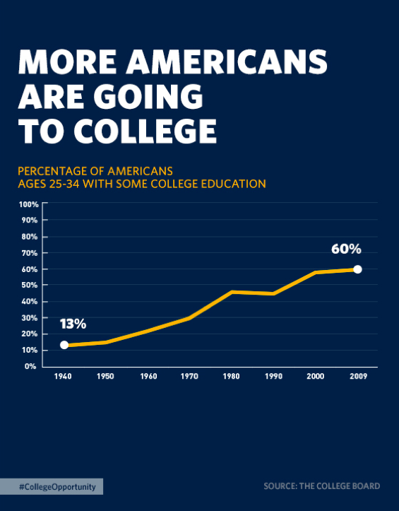
- Write messages, not titles. Instead of using generic titles, why not write the conclusions you want your audience to grasp? Isn’t “More Americans going to college” more powerful than “Percentage of Americans with some college education”?
(3) Use fonts to say something
A fundamental principle design is that nothing should be left to chance. Every single element of a design should be there for a reason. It should be there to tell you something. However, many presenters do not give the deserved prominence to fonts. Bear in mind that—even if unconsciously—the typeface you use tells your audience who you are and what feelings you want them to associate your presentation to. The State of the Union supporting material follows three main guidelines:
- One typeface. The same font has been used throughout the presentation.
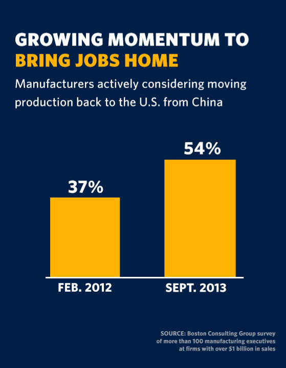
- Hierarchy. The style follows clear principles of hierarchy. In the example on the right you can see that more emphasis has been given to the main message of the slide: “Growing momentum to bring jobs home”. Then the subtitle—which makes you understand what the chart is about—is a thinner version of the same typeface. And finally the source is even smaller. Hierarchy helps to guide the view’s eye based on the relative importance of the elements in your slides.
- Highlight what’s important (yes, again). In the same example, within the main message, “bring jobs home” is clearly the key. It's no wonder another colour was used to highlight it.
(4) Make it logical

Scott Schwertly—founder and CEO of Ethos3—says that “creating a presentation logically means organizing the content in order to maximise audience understanding”. There are different ways to make a presentation logical. The underlying theme of the State of the Union address was that the Obama administration has been creating “more opportunities for all”. In order to give the presentation a sound structure, they created a ‘Master’ slide showing all the people which enjoyed more opportunities during the last years and repeated it throughout the presentation, each time introducing a different topic (workplace rights, education, fair wages, etc.). Trough this technique Obama made us understand where he wanted to go next. He gave his presentation a logical flow.
(5) Opt for people
In this document, there are loads of slides showing real people doing real things (people working or enjoying their leisure time, kids at school etc.). In his book Presentation Zen, Garr Reynolds says that “we are naturally drawn to images of people. […] [which] get our attention like few other images can”. I believe that by showing slides of real people in your presentation you achieve two objectives: (a) you make your point more interesting and relevant (b) you make a personal connection with your audience.
Unfortunately, most presentations today are still average. However, I was pleased to see that the U.S. government put so much thinking in designing such an effective visual representation of the State of the Union address. Not that I needed a confirmation by Obama, but this once again proves that presentations matter. Design is everywhere and we can learn presentation design principles even from the President of the United States. YES WE CAN.