24 November 2013

3 Killer Ways To Open Up Your Next Presentation

Having attended quite a few presentations over the past years, I can say today that speakers do not pay attention to how they open their speech. Most people treat their opening as any other moment of their presentation. However, we know that people decide whether or not your ideas are worth listening to based on how you start your speech. Think of how many times you looked for inspiring videos on the internet and made a decision as to whether to continue watching a particular video in the very first minute, or even seconds. Isn’t that true? We decide whether people are worth listening to mainly based on how they start.

So my question for you is, what are the most effective ways to open a speech or a presentation? How can you make sure that your audience do not switch channel? On a quest to know the answer to that question, I started studying and following the world’s best speakers to understand how they go about opening a speech. What I found out is that the answer is not unique. There are many ways to start a speech or a presentation in a powerful way. The one you choose depends on many factors, such as the topic, the audience, the circumstances and the way you feel more comfortable with.

I think the three most powerful ways to open a speech are the following:
  • Tell a story
  • Ask a provoking question
  • Reveal a shocking statistic
Below you find three great TED talks in which the speaker either started by telling a story, or by asking a provoking question, or by revealing a shocking statistic. For the purpose of this article, you can focus on the very first minute of each presentation. However, I suggest you to watch the complete videos since the speakers share important topics in an enjoyable way.    

(1) Tell a story


In this talk, Andrew Stantonfilmmaker and writer of Toy Storyshares what he knows about storytelling. And guess what, he starts by telling a funny story which then leads him to introduce his topic. You do not have to tell a funny story, you can tell a personal story or an emotional one. If you start by telling a story, you bring down the wall between you and your audience by making a honest connection with them. 


(2) Ask a provoking question


Simon Sinekauthor of the book Start With Whyshares his Golden Circle theory explaining how to become effective leaders and inspire change. His key message is that “people don’t buy what you do but why you do it.” How does it start? How does he make the audience care about his ideas? He asks a few provoking questions: “How do you explain when things don’t go as we assume? Or better, how do you explain when others are able to achieve things that seem to defy all of the assumptions?”. The answer to those questions is his core theme.   


(3) Reveal a shocking statistic


Since I live in England, I know who Jamie Oliver is. He is celebrity over here. And I also had the pleasure to eat in one of his restaurants. But I did not know he was so passionate about how food can save peoples’ lives. The purpose of his talk is to make Americans aware of how bad eating habits are killing them and their children and how we can all transform the way we feed ourselves. How does he go about making his audience care? He reveals a shocking statistic. “Sadly, in the next 18 minutes when I do our chat, four Americans that are alive will be dead from the food that they eat. My name’s Jamie Oliver. I’m 34 years old.” Before even introducing himself, he shared a shocking statistic. As TEDx organizer Jeremey Donovan wrote in his book How to Deliver a TED Talk: Secrets of the World’s Most Inspiring Presentations, one way to start a presentation is by sharing something unexpected that gets people disrupted.


Next time you give a speech or make a presentation, do not underestimate the way you start. Remember, people decide whether your ideas are worth spreading in the very first minute of your talk. Make sure your audience does not switch channel. 

IMAGE: Evan Forester via Flickr

17 November 2013

5 Top Tips to Design Technical Presentations

When I share my ideas on presentation design, many people tell me “Yes, you’re right! However, when it comes to making a technical presentation, your approach doesn’t work”. By “your approach” they mean designing simple and highly visual slides.
I believe this is not correct. As a general rule, any presentation should be as simple and as visual as possible, especially technical presentations. This is because when you make a technical presentation you run the risk of boring the audience even more than usual. Technical presentations usually include loads of data and details. Therefore, if you do not design them with the audience in mind, (1) people will get bored (2) they will not understand what you are talking about.

When I was at university I attended a course called Country Analysis. Part of the evaluation was based on studying a country’s economy and presenting the results to other students. It was a technical presentation indeed. Nonetheless, we tried to design our presentation with our audience in mind and below you see the result. I know many of the slides will not tell you much. However, slides are not meant to be self-explanatory. Slides need you! You are the presentation and your slides are only there to amplify your message.


5 tips on how to make any presentation visually captivating        


The following tips can be applied to any kind of presentation. There is no reason why a technical presentation shouldn’t be pleasing to our eyes.

(1) Make data simple
This point is particularly relevant to technical presentations. Make sure your charts and tables only include the essential elements. If something does not add value to your message, leave it out. This strategy will help you achieve the most important of all objectives: letting your audience understand and remember what you are saying.
Also, instead of using generic titles, why not write a short statement summarising your key point? (More on data visualisation here).

The usual grid behind the data you find in may graphs have been removed. The slide background does not disappear behind the graphs. Only the essential elements are shown helping the audience focus on what is important.

(2) Combine images and text
One of the most powerful techniques in visual design and communication is bringing images and text together. When people see something written, they will have troubles remembering it. If you add a picture though, the probability of your audience remembering your point will increase exponentially. However, make sure you choose high-quality images. Instead of searching for them on Google Images (as most people do) why don’t you use your own photos or higher-quality sources like Flickr, for example? 
As a side note, notice how text is sometimes placed at an angle. This creates a more dynamic feeling.

If you want to say that a country's economy is mainly based on tourism, you don't need to show loads of data and text. Just show a beautiful image with one statement. It will then be up to you to inform the audience about the facts. 
(3) Choose one typeface   
When it comes to typefaces, the two mistakes I see most frequently are (1) the use of non-professional fonts (2) the use of too many fonts. Choose one typeface only and stick to it throughout your presentation. Two could be okay too, as long as you have a reason for that. In the presentation above I used Gill Sans, a professional yet young typeface which also fit together with the blackboard background. Gill Sans, like other typefaces, is nice because it comes with a whole type family. This means that you can choose among different weights of the same typeface and that allows you to stress certain words or sentences while keeping a sense of unity. 

In this slide I used three different weights of the same typeface (bold, normal and light). The aim is to use hierarchy to guide the viewer's eyes. The big statement will be noticed first, then you will look at the data and finally you will notice the source.
(4) Use colour wisely  
The thoughtful use of colour is essential in any good design and has implications to the effectiveness of your message too. Colour can be used to highlight certain points, such as the key word of a sentence, or the key bar of a chart. Notice, for example, how I used colour to highlight the subject country of our studythe Bahamasin the bar charts. As soon as you show those slides, peoples’ eyes will first point at that particular bar. It’s a matter of contrast. People are naturally attracted by contrast (in colour, in size, in shape, etc.).


(5) Achieve unity
Finally, what you should be aiming at is to achieve unity. The whole presentation should be greater than the sum of the individual slides. There are many ways to accomplish that and some of them have been pointed out in this article. Using the same typeface, visualising data in a certain way, designing slides in a consistent manner, using colour wisely are all elements which convey a sense of unity. You may think of them as small details, but it all adds up.

Your audience will not consciously understand the design principles behind your slides, but they will understand that there is something different in your presentation. Those design principles will help you convey a sense of unity and harmony, which is the best gift you can give to your audience.   

10 November 2013

5 Simple Ways to Design Slides Like Billboards

Have you ever thought about how your slides would look like if they were designed to be billboards? If you think about it, good billboard design is like good slide design. If you pay attention to the design of billboards, you will realise that many of themat least the ones that are well designedshare common elements:
  • They are highly visual
  • The type is big
  • They have a lot of empty space
Why do you think billboards share those characteristics? The answer is straight-forward: billboards have to get noticed, be understood quickly and be remembered. Billboard designers know that people should be able to understand the message they want to convey within a few seconds, especially if they are driving.
In her book Slide:ology, Nancy Duarte says that "Presentations are [...] more closely related to billboards than other media... Ask yourself whether your message can be processed effectively within three seconds. The audience should be able to quickly ascertain the meaning before turning their attention back to the presenter."
Obviously the audience does not have the same time limitation of a driver, yet adhering to this guideline will limit yourself from cluttering your slides with unnecessary elements. Your job as a presenter is to make it easy for your audience to understand what you are talking about.
Since I live in London I am surrounded by billboards. I am not saying that all of them are well designed, but many of them are. I like to pay attention to the design of billboards because they are a source of great inspiration to me and I suggest you to do the same.
Among the many billboards I am surrounded by, McDonald’s stand out. I think McDonald’s is one of the brands which get it right. Below are some examples (some of them are snaps I myself took recently).


Notice how visual the design is. There is a lot of empty space and text can be easily read from a distance.

5 Lessons we can apply to Presentation Design


(1) Make it visual
Look at how McDonald’s use visuals to convey a message. A burger is used instead of the number 0, a fry with some ketchup gives the idea of “loading”. Remember the Picture Superiority Effect: concepts are much more likely to be remembered if they are presented as pictures rather than as words. 

(2) Make type big
Text in too many slides is impossible to read. Do like McDonald's, make type big! Guy Kawasaki has a funny take on this. He says that to choose the right dimension for your typeface, you should take the eldest person in the audience and divide his age by two. But don't follow his rule if you are presenting to a secondary school class. I don't fancy following strict rules, but in general I would suggest you to use at least 30 points. 

(3) Rule of Thirds
McDonald’s don't follow the Rule of Thirds strictly. However, if you start looking at how they design their billboards, you feel they pay attention to it. So should you with your slides. Don’t necessarily follow the Rule of Thirds rigidly, but be aware of it and use it when it makes sense.

(4) Empty space
This is my favourite design concept. Look at the billboard with the fry. One element, one word, that’s it. Empty space is a fundamental principle of good design. It is the empty space that makes the positive elements of your design stand out.


(5) Have a visual theme
When you think of McDonald’s, I am sure the colours that come up in your mind are red and white. Isn’t that true? This is because McDonald’s have a consistent visual theme. When you make a presentation, you need to make sure that the final result is greater than the sum of the individual slides. You need to convey a sense of unity. Unity can be achieved in many ways. You can use the same background colour, the same typeface, a certain colour appearing throughout the presentation, a particular element which repeats itself throughout the slides. However, you don't need to use a pre-defined template found in the software. McDonald’s is able to convey a visual theme without having a pre-defined template.

Design lessons are everywhere. You can improve your presentation design skills even on the street, as long as you pay attention to what surrounds you.  

IMAGE: Jennifer Snyder via Flickr

3 November 2013

The Three Secrets of Communication

A few days ago I have been lucky enough to discover a video of a lecture Carmine Gallo gave to some students at the Stanford University. Carmine Gallo is the communication coach for the world’s most admired brands and author of the best-selling book The Presentation Secrets of Steve Jobs. In this lecture he pointed out three secrets all inspiring messages share. Whether you are an entrepreneur, an employee, a student or even a professor, I do recommend you to watch this video, there is so much you can learn from it. However, for those who are too busy I summarised his ideas here.


According to Carmine Gallo, there is always a story to tell and everyone has the ability to tell a better story to inspire people. He says that a message is inspiring if it is:
  • Understandable
  • Memorable
  • Emotional
The good thing is there are specific techniques you can start using today to make your message understandable, memorable and emotional.

(1) UNDERSTANDABLE


There are many techniques you can use to make your message understandable. The one Carmine Gallo shares with the Stanford students is: Creating Twitter-friendly headlines.
You all know that the longest tweet you can share is 140 characters. Creating Twitter-friendly headlines means that you should be able to explain what you do in 140 characters or less. If you cannot describe what you do in a sentence, think about it until you can.
Why should you create Twitter-friendly headlines? Because “the brain craves meaning before details”. The brain wants to see the big picture first. Therefore, before going into details you need to make it easy for people to understand what your purpose is. Many companies have created a mantraa one-sentence visiontelling the world what they do:
  • Nike: “Authentic athletic performance”
  • Target: “Democratize design”
  • Mary Kay: “Enriching women’s lives”
If you ask Larry Page and Sergey Brin what Google does, all they’ll tell you is “Google provides access to the world’s information in one click”. That’s it!
Ask yourself: “How can I explain my idea in 140 characters or less?” I asked myself this question and the answer I came up with is “Echo Presentations help people tell their stories trough a presentation that rock.”

(2) MEMORABLE


After you have created your one-sentence vision, you need to make sure this is memorable. Again there is more than one way to make your message memorable, but I particularly like one technique Gallo explained. This is something he considers “one of the most powerful techniques in communication”: the Rule of Three. The Rule of Three means that in short-term memory we are only able to process about 3 pieces of information, not more. So next time you make a presentation, don't overload your audience with 10 points, just give them 3 reasons why they should care about your idea or your work.
It is interesting to see how the Rule of Three is embedded in our society, even if we do not pay attention to it. Carmine Gallo gives some examples:
  • Nike: “Just do it” 
  • Obama: “Yes we can”
  • The colours of most flags are three
  • The three musketeers
  • Many companies have three letters in their logos (DHL, IBM, SAP and many more)
This is the way our mind works. Our mind likes to see groups of three.

(3) EMOTIONAL


Making a message understandable and memorable is not enough. Great communicators make it emotional too. John MedinaProfessor of Bioengineering at the University of Washingtonsays that “the brain does not pay attention to boring things”.
Let’s say in a few days you have to give a presentation to your boss, customer or professor. I am sure you don't want to make a boring presentation. One way to avoid this is to make it emotional. How do you make a presentation emotional? Well, tell stories! Tell stories about your product, tell personal stories or stories about your customers. A case study is a story. When you tell stories you are making an emotional connection with people. Great communicators tell stories. And when you tell stories, think visually. Carmine Gallo explains what the Picture Superiority Effect is. When you deliver information verbally, people remember 10% of it. If you add a picture, people remember up to 65% of what you say.
To my astonishment he reveals a sad figure: the average PowerPoint slide has 40 words. This is way too much. People cannot read and listen to you at the same time. If you want people to listen to you, you need to include as fewer text as possible. Seth Godina great public speakersays that you should never use more than 6 words on a slide, no matter how difficult your concept is. Thinking visually takes work. It is hard to do but it is worth it.

Next time you'll make a presentation, make sure you articulate your idea in a way that's understandable, memorable and emotional. If you do that, you will win people over.

2 November 2013

My First Piece of Art

Today I am very excited to announce that I have created my first piece of art for someone else (please allow me to call it this way).
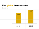
This is a presentation I made for an Italian company looking to enter the beer market. They had carried out a market research first and needed to present it internally.
This is the result!


I hope this work is only the first in a long series.

25 October 2013

3 Design Lessons from iOS 7

I have recently came across an article by Carrie Cousins in which she shares some tips on how to design an app for the new Apple iOS. You can find the complete article here. While reading it, I thought that many of her tips can also be applied to the design of slides.
In this post I will go through three of Carrie’s tips on designing for iOS to show you how you can improve your next presentation.  

(1) Think Flatter


Carrie says “Apple’s iOS 7 is designed with flat in mind [...] Gone are all of the once-trademark skeuomorphic style icons and effects. In are single-colour boxes, lots of coloured type and lots of space [...] The design guidelines from Apple for iOS 7 encourage simplicity in design and usability.”
Apple’s design encourages simplicity, so should yours. Some time ago I shared with you three tips on how to make your presentation more effective (3 Tips on How to Prepare a Presentation). One of those tips was Keep it Simple. In order to keep a presentation simple you need to carefully think about what to include and what to leave out. Ask yourself what the essence of the message you want to convey is.

Apple do not only make their products simple, they also apply simplicity when crafting their presentations. Here are two slides Apple used during their recent introduction of the iPad Air. Look at how simple and easy to understand they are.    

Here Phil Schiller - senior vice president of marketing at Apple - explains that the bezel around the display is 43% thinner. Instead of cluttering the slide, he only shows the previous iPad, the new one and the number 43%.
Then he says that the iPad Air weighs only 1 pound. Again, there is no need to clutter the slide with anything else.

(2) Focus on Type


Carrie’s article reads “Type is the key to the iOS 7 design [...] Hierarchy in text is vital. Take advantage of colour and different weights to make the flow of type and user interface elements clear and easy to follow.”
The typeface you use in your presentation and how you use it is as important as it is for the iOS 7 design. I will share more details on that in a later post, so stay tuned. For now bear in mind a few concepts:
  • Type has both an aesthetic quality and a function
  • The choice and usage of type is one of the elements which differentiates professional presentations from average ones
  • Shape, size and colour of type all affect the meaning of the words you write and the feelings of the audience  
The presentation below is a perfect example of typeface used wisely. First of all, the font itself is professional. Second, colour is sometimes used to highlight the core point. For example, in the first slide the core point is the verb "engage", that is why it is of a different colour. Finally, the same typeface and the same colours are used throughout the entire presentation, giving a sense of unity. The aim is to make the whole greater than the sum of the individual slides.


Slides by Empowered Presentations

(3) Go Borderless


“[In iOS 7] much of the design interface is borderless [...] Look at the calendarno gridlines in the dates [...] Look at the clock or built-in weather appgridlines are also gone [...] What has replaced those gridlines is space.” As I have already written in a previous post (Less is More: The Power of White Space), “white” or “negative” space is a fundamental principle of good design. It improves visual clarity which, in turn, helps the audience focus on what is important. It is the negative space which lets the positive elements of a design stand out.

Here is a slide I used in a presentation last year. The Leaf Meter is a product made by an Italian company: Loccioni Group. It visualises in real time the data relative to the energy performance and the environmental impact of buildings. I could have cluttered the slide with text, numbers and statistics. However, to make sure the audience would follow me, I only showed a real photo of the product with its name leaving plenty of negative space. Then it was up to me to talk about it in detail.


If in your next presentation you will think flatter, focus on type and go borderless, you will go one step forward with your presentation skills.  

More:

12 October 2013

How to Display the Data

How many times have you heard your professor or your boss saying “where are the numbers supporting your statement?”. I bet it has happened many times. Probably your professor or your boss was right. You often need to support your case by showing some data.
However, most presenters show the data without asking themselves whether or not their audience will actually be able to see it and understand it. They do it just to prove they have done some homework without having the audience in mind. The result? Incomprehensible data displays. But if the data you show is incomprehensible, you are incomprehensible too and this is something we all want to avoid. The purpose of this article is to make you aware of how to display the data during a presentation in a way that is meaningful for your audience.

First of all, you need to understand what the purpose of data displays is in a presentation setting. The purpose of a graph is to show quantitative relations, not precise values. If your goal is to show precise values, a table might be more appropriate. Therefore, different data requires different formats:
  • Tables should be used when the aim is to show specific numbers
  • Graphs, such as bar graphs, can be useful to make comparisons
  • Line graphs are best for displaying trends
  • Pie charts are also good for making comparisons, but only if you have to compare few values
There are two essential principles you should be aware of when presenting data: reduce and emphasise.

(1) REDUCE


Graphs themselves can be hard for the audience to understand, so if you add decorative elements such as company logos or other extras you are doing nothing but making it even more complicated for your audience to understand. Your job is instead to help your audience understand the data you are showing. To do that you should avoid creating noise, that is, you need to include as much as necessary, but not more. The effectiveness of your quantitative display mainly depends on your decision about what to include and what to exclude. Graphs, charts and tables can become much more effective and easier to understand if you only reduce the nonessential. Here I am not talking about removing important elements, but only the nonessential. The problem is that what most people think is important showing in a presentation is actually not. So the next time you design a graph for you presentation, ask yourself two questions:
  • What is the essence of the point your graph is intended to make?
  • Are there any nonessential elements that can be reduced (better yet, removed)? 
      
BEFORE

In this slide there is too much clutter. The image of the map does not add anything to the core message. Nor do the date and the page number at the bottom. Also, numbers are too small to be seen and colours have not been chosen purposely.

AFTER

This is a remake of the previous slide. Only the essential information is displayed, figures are visible and can easily be associated to the respective country.


(2) EMPHASISE


To emphasise means to make it clear for the audience what the most important point is. There are basically two ways to achieve that:
  • You can use contrastsuch as colourto highlight the most important bit of your data display
  • You can also write a statement rather than a title
This presentation is about The Bahamas, that is why I have highlighted The Bahamas in red. Also, instead of using a general title, I used a direct statement to make it clear what I was talking about.


COMMON GRAPHS


Pie charts
I don’t fancy using pie charts because we are not very good at accurately grasping the differences in size among the slices, especially when those are very thin due to the fact that the values you want to compare are too many. In this case it is better to use a bar graph. But if you really want to use a pie chart, keep this in mind:
  • Do not use 3-D effects. This is actually a general rule which applies to the design of any kind of graph. Never use 3-D effects to show two-dimensional data. It is not only aesthetically unpleasing, it does not make sense from a “mathematical” perspective either.
  • Do not use a legend. Rather, put labels inside the slices.
      
BEFORE


AFTER


Bar graphs
Bar graphs are best for making comparisons among values. You can use vertical or horizontal bar graphs almost indifferently. Only be careful with the number of values to be compared. When they are quite a few, I would recommend to use a horizontal bar graph in order to avoid setting the labels on the x-axis at an angle. Examples are shown above.

Line graphs

Line graphs are good at showing trends over time.


Now the question is, why do most presenters not follow those basic guidelines? According to me there are two main reasons. The first one is that they are not aware of them, the secondand most important oneis that they are afraid of simplicity. People confuse simple with simplistic. Making data displays simple is not about excluding important information. Rather, it is about showing the essential information without clutter or extra decoration in a way that is clear and meaningful for the audience.

Finally, let me tell you something. Do not confuse slides with documents. If you have detailed and complex data that is absolutely necessary for your audience to see, then create documents and hand them out. It is okay not use slides, you don’t have to use slides all the time. You might mix your presentation with slides when appropriate and handouts when you need to show detailed information. But when you do use slides, I suggest you to practise reduction, emphasis and to choose the correct chart.


Where do you want to be?

The ideas in this article have mainly been collected from the book Presentation Zen by Garr Reynolds (chapter Simplifying the Data) 

28 September 2013

Learning from Photography: The Rule of Thirds

The Rule of Thirds is a principle used by professional photographers when taking pictures. The idea behind it is to make photos more interesting, balanced and harmonious.

How does it work?


Imagine to break down an image into thirdsboth vertically and horizontallyso that you have 4 intersecting points, also called Power Points (they really are called like this).


What professional photographers do is they place the points of interest of a photo either along the dividing lines or on the power points. Believe it or not, our eyes are naturally attracted by those points, even if it happens unconsciously. Studies have shown that people’s eyes go to the intersection points more naturally rather than pointing somewhere else. That’s why images following the rule of thirds appear more natural and harmonious.
Let’s have a look at a few examples.


In the above image, you can see how the tiger’s body perfectly follows two of the dividing lines, the upper horizontal line and the vertical one on the left.


Here the point of interest is the lighthouse. No wonder why it has been placed along a vertical line.


This one is my favourite. Where have the eyes of this wonderful kid been placed? Around one of the power points.

How can you apply the Rule of Thirds to your slides?


The Rule of Thirds is a simple but powerful principle which makes images look interesting, professional and harmonious. Since a PowerPoint presentation should be a visual representation of your story, why not use this “rule” to make our slides more interesting, balanced and harmonious?
Most presenters tend to place every element of a slide at the centre. However, symmetry is not always pleasing to our eyes. Asymmetrical designs are much more appealing.
For me, the best way to apply this principle to presentation design is to combine images and text. Remember, research shows that it is easier for the audience to remember and understand your message when you combine images and text together.

Here is a brief presentation I made to show you how to bring the rule of thirds into your visuals. I have mainly collected real slides I used in previous presentations. Just imagine to see a 3x3 grid in each slide and think of what you now know about this principle. Of course the slides alone have no or little meaning without me speaking, but (1) this is not the purpose of the article, the purpose is to learn about the rule of thirds, (2) if people can understand your slides without you being there, this might be a sign of poor presentation design.


As you know, rules are made to be broken, but you can only break what you know. Being aware of the rule of thirds is a good step towards making your presentations more dynamic and beautiful, but you don’t have to apply it all the time. Knowing how to break the rule is as important as the rule itself.

More: