Hundreds, thousands of years ago, when people didn’t know how to write, they used to pass on their knowledge between generations by telling stories. Recently, I had the opportunity to speak with Cristiano Carriero, Content Manager at Apra and Editor at Bloglive so I thought I’d get him to share some of his insights into storytelling. Cristiano is a storyteller. He lives to write and writes to live. He helps companies sell their products through stories. It might not sound romantic, but even Dante Alighieri used to write for commission. Cristiano is a modern copywriter, ranging from claims to tales and—when he has time (he says we always have time as long as we know how to find it)—writes novels. The last one is Domani no.
First of all, congratulations for your recent presentation at the Master Fiordirisorse. I very much liked it both content-wise and design-wise. Do you follow any particular guidelines? Are you supported by a graphic design expert?
Yes, I am. I believe in collaboration. I come up with words, stories and an idea of what my presentation should look like, but then I cooperate with Graziano Giacani. Our aim is to find a visual identity which would distinguish myself. We look for elements which are a good fit with my personality, look and tone. An example is the bear I used in my slides. You know Andrea, it’s a pity you were not among the audience, otherwise you would have realised my presentation was tailor-made to my speech. That’s why I started with a game and, at a certain point, took off my jumper which was having too much attention. Nothing is left to chance.
You talked about a topic which every presenter (and not only) should be aware of: storytelling. What is storytelling?
Much has already been said on storytelling. To me storytelling is the art of making people stick with a story, of forcing them not to leave it in order to find out how it ends. As counterintuitive as this may seem, you can also use storytelling to sell products and services. Of course it all depends on how good you are at telling stories. However, the good news is storytelling is not an innate skill. In fact, today you can practise every day on the web.
One of the pieces of advice you gave is to “find out who your readers are and why they read what you write”. When it comes to presentations, how do you find out who your audience is and why they care about your ideas?
Let me start with a metaphor: if I am a referee I need to know the teams I am going to referee. I need to understand how they play, whether one team is stronger than the other, which kind of game I should expect. This is not because you want to be biased; rather, you want to understand as much as possible what to expect from the match. The same holds with a presentation. Before starting to prepare it, you should have an idea of which kind of audience is going to listen to you. Will they understand your points? Are they curious? Are they students or managers? Do they know anything about what you will be talking about?
Another tip you gave is the use of examples and concepts familiar to the reader. Giving examples is also important during a presentation. Could you tell us why they are so powerful?
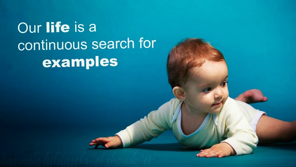
Using examples is essential in any context. Children need examples, our life is a continuous search for examples. The metaphor—which is a poetically attractive element—is the highest form of example.
 You talked about reader engagement. How do you engage your audience?

To engage the reader means to write with the reader in mind. If you write for yourself, nobody will appreciate and share you work. You need to challenge people’s ideas, ask questions and make people angry if necessary. This is true not only when you write, but when you present as well. Never look at the same group of people in your audience! This is one of the keys to making a successful presentation. By looking at peoples’ eyes you can easily understand whether your audience is engaged or not.
Are there any secrets to make an average story a great one?
There is no secret to telling a great story. However, there are writing techniques: a nice intro, an ero, a bad character, a fall and a comeback, a memorable conclusion. These techniques are also used (or should be used) by companies telling the story behind their brands or products. For instance, if you are writing a post about social media within companies, the bad character could be a manager preventing employees from using social media tools, the fall could be a Social Media Manager suffering from dissatisfaction before going back up. There is always a story to tell.
Why do you think people should use visual elements and be original when searching for images?
Images are getting more and more trivial on the web. Everybody knows how to look for an image on Google Images. Those who are more proactive go to places like Pinterest to steal photos posted from others. But think about how creative a presentation with an ad hoc and Google index-linked infographic can be. There are tools which allow you to create visually compelling infographics, such as Visual.ly, Google Chart o Infogr.am. Although my advice is to ask an expert for support, especially for presentations or posts for which the stakes are high.
"Sometimes it takes longer to find the right title than writing an entire post”. Do you think we should also spend time to find a great title for our presentations?
The title is 70% of your work. And yes, this holds for presentations too, especially today when presentations are being searched for on Slideshare to be downloaded and shared. In general, the title is always fundamental. Think of a film, a song, or a book. How many times have you been attracted by a book because of its title? How important is the title for a film? It's so important that it gets translated into different languages in order to accommodate different tastes and habits. In a world dominated by social media, a title is memorable when it becomes a hashtag in Twitter.
“Every text, be it an sms, an email, a presentation, should include a golden coin for the reader”. What do you mean?
The golden coin is a memorable sentence. That sentence that used to force you to dirty a book by underlining it. That sentence which must be tweeted or shared on Facebook together with the post you wrote. That sentence which pushes your audience to make a photo of your slide. That sentence which helps make your work memorable. I call it golden coin because today we read much faster than yesterday, so we more than ever need a precious ingredient. An ingredient which once would have been looked after, today it would be shared.


