29 March 2014

How to Use Colour Effectively in Presentations

In my previous post I introduced some Colour Theory concepts. We've learnt the difference between hue, value and saturation as well as some basic colour combinations derived from the colour wheel: monochromatic, analogous and complementary. Today I'd like to show you how to apply these concepts in your next presentation.   

Professional presentation designers don't choose colours randomly. Rather, they create a colour pallet. The good news is you don't have to be a professional designer to be able to create your own colour pallet. A smart and easy solution is to pick up the actual colours of an image. And you can do that directly on your presentation software, like PowerPoint or Keynote. 


Photo credit: Snurb via Flickr
Say for example you are asked to make a presentation on the Green Economy. In order to give your slides a consistent look, you may want to start from a photo related to the main theme, like this wind farm on the right. 

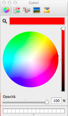
Then, when it comes to choosing a colour for the text you want to combine the image with, instead of picking it up randomnly you can select exactly the colour you are looking for. To do that, you need to click the colour picker on the desired area of the image. In the example below I wanted the word "green" to be of the same colour as the grass in the wind farm. This technique could also be useful in a business presentation, where you can extract the real colour of your company logo and use it throughout your slides. Do not choose a similar or "close enough" colour, choose the same colour. Then, if necessary, you can adjust the value and make it lighter or darker for a better contrast. 


You can also work with free online resources to create a colour pallet which is appropriate for the theme of your presentation. My favourite is Kuler, a web-based tool from Adobe. The way Kuler works is straightforward. It allows you to upload the photo you want to create a colour pallet from and automatically picks up the relevant colours from it. If you are not happy with the default choice, you can move the sliders onto a different area of the image to pick up different colours. As you can see here, the result is immediate. You have created your own colour pallet to be used throughout your presentation; a colour pallet which is consistent with the main theme: the green economy. 


A nice thing is that by selecting the colour wheel at the top right you know exactly which colours Kuler created for you. For example, the green at the centre is 53, 65, 15. It's that simple!


I always use Kuler for my presentations. As you can see for this chart I didn't choose a random green, I chose exactly that green at the centre. I have only made it a bit lighter to increase the contrast with the dark background. 


Kuler is so cool to automatically create colour schemes for you. This means that you don't have to be an expert to choose the right colour combinations. Kuler allows you to select the colour scheme you want to use, be it analogous, monochromatic, complementary, etc. Of course having at least a general understanding of Colour Theory is useful. However, Kuler makes it easier.

1 March 2014

Colour Basics: Introduction to Colour Theory


Let’s face it, whether you like it it or not, the colours you choose and the way you use them have a profound impact on the effectiveness of your visual message. Colours can be used to achieve many objectives. You may want to evoke emotions, to emphasise, to get attention and so on. You don’t want your audience to bark up the wrong tree because of your misuse of colours. That is why it is important to understand the basic principles of colour theory.


COLOUR THEORY

The three main concepts you need to be familiar with are hue, value and saturation.


Hue
The hue is the pure colour. Every time you mention a colour (e.g red, blue), you are referring to the hue. In this version of the colour wheel, the hue is four steps from the outside (or from the inside). As you move out more black is added to the pure colour (shade). As you move in you get a higher percentage of white added (tint). 


Presentation software tools like PowerPoint or Keynote allow you to work with a colour wheel which is derived from the traditional one. You can choose a pure colour (hue) by putting your cursor at the outermost section of the colour wheel. If you want to get a lighter tint you can move the cursor toward the centre of the wheel. By scrolling down the slider on the right of the wheel you get a darker shade of the hue.
Value
When you adjust the tint, you are adding more white to the hue getting a lighter value. When you adjust the shade, you are adding more black to the hue which becomes of a darker value. 


Here the background colour is a classic blue. In the slides below the background value has been adjusted. 

The background colour of the slide on the left is a darker shade of the original. 
On the right you have a lighter tint.


Saturation
Saturation is the relative brightness or dullness of the hue. In the example below, the photo on the left has a relatively high level of saturation. The version on the right has less saturation, getting closer to grey.

Photos by Asher Photography Studios

You can make your visuals look better by using only three basic colour combinations based on the colour wheel: monochromatic, analogous and complementary. In reality there are more than three options, yet working with these three combinations will significantly improve your design and give it a professional look. 


Monochromatic
A monochromatic scheme uses only one colour (hue) in different shades and tints or at different levels of saturation.

Both slides use only one hue (plus white) in three different tints or shades.


Analogous
Analogous colours sit next to each other on the colour wheel. 

This slide uses three hues (plus white). They look similar due to their proximity on the colour wheel. One of the hues has been used to make one of the elements pop out. 


Complementary
Complementary colours are opposite colours. They sit across from each other on the colour wheel.

Complementary colours create a strong visual impact.

“Colour used well can enhance and beautify, but colour used poorly can be worse than no colour at all.”  
- Maureen C. Stone, author of A Field Guide to Digital Colour
 As a takeaway lesson I'd like to stress two points, especially for the beginners:
  • Never use more colours when less do the job well
  • Use colour for a reason 
Have you ever thought why traffic lights use red and green? Apart from the fact that common sense makes us associate red with risk (stop) and green with safety (go), red and green sit across from each other on the colour wheel. In order to give colours opposite meanings we chose opposite colours. Next time you create a presentation, think carefully about the colours you choose and make sure nothing is left to chance.  

Now that you know the basics of colour theory we can move on and learn how to work with colours to create slides that rock. But this is something I will write about in my next post. Also, I will soon introduce a very cool tool, so stay tuned. 


Most ideas in this article have been gathered through the books Presentation Zen by Garr Reynolds and slide:ology by Nancy Duarte.

6 February 2014

5 Presentation Design Tips from Obama

I am not kidding, today I am going to share 5 presentation design tips directly from the President of the United States. On Tuesday 28 January, Barack Obama has given the 2014 State of the Union address. To my surprise, the speech was also accompanied by a display of charts, graphs and other visual representations. I guess it’s one of those things which have always been done that I was not aware of. I was so happy to see that the visual representation of the speech was extremely well designed. It is not a PowerPoint presentation though. Rather, it is more like a document highlighting why the Obama’s policies were so important for the country. That is why sometimes it shows detailed information which I would not recommend to include in an real presentation. However, the overall design is clear and attractive so I thought I’d share with you 5 design principles from this document which will help you make your next presentation more effective. 


(1) Think visually
Making a presentation is about expressing ideas and concepts in a visual way. You want your audience to be so captured by your message that they will eventually adopt your view point. To achieve that, you need to understand that the best way to communicate ideas is to express them visually. The Picture Superiority Effect tells us that if you hear or read some information three days later you’ll remember 10% of it. If you add a picture, you will remember 65%. Information retention increases sixfold. Combining text and pictures will make your communication superior. 

Tip: If possible, use full bleed images and put your text within the image.

(2) Display data clearly 
When it comes to creating charts and graphs, you need to make it as easy as possible for your audience to understand your point. In her book slide:ology, Nancy Duarte says that “to communicate your data effectively, you first must articulate the conclusions you want your audience to adopt”. This is because any audience might jump into opposite conclusions by looking at exactly the same graph. That’s why you need to ask yourself what you want your audience to remember about the data you show. Here are three pieces of advice to help you display your data effectively.
  • Remove clutter. Anything which does not contribute to the effectiveness of your message is clutter and should be eliminated. Background elements like grids and legends usually don’t add any value, therefore they should either be reduced or removed altogether. 
  • Highlight what’s important. If you are to show through a chart the economic performance of the United States versus that of other countries, you might want to use two complementary colours, one for the U.S. bar and another one for all the rest. This way your audience will immediately understand what the focus of your chart is.
  • Write messages, not titles. Instead of using generic titles, why not write the conclusions you want your audience to grasp? Isn’t “More Americans going to college” more powerful than “Percentage of Americans with some college education”?     
(3) Use fonts to say something
A fundamental principle design is that nothing should be left to chance. Every single element of a design should be there for a reason. It should be there to tell you something. However, many presenters do not give the deserved prominence to fonts. Bear in mind thateven if unconsciouslythe typeface you use tells your audience who you are and what feelings you want them to associate your presentation to. The State of the Union supporting material follows three main guidelines:
  • One typeface. The same font has been used throughout the presentation.  
  • Hierarchy. The style follows clear principles of hierarchy. In the example on the right you can see that more emphasis has been given to the main message of the slide: “Growing momentum to bring jobs home”. Then the subtitlewhich makes you understand what the chart is aboutis a thinner version of the same typeface. And finally the source is even smaller. Hierarchy helps to guide the view’s eye based on the relative importance of the elements in your slides.
  • Highlight what’s important (yes, again). In the same example, within the main message, “bring jobs home” is clearly the key. It's no wonder another colour was used to highlight it.
(4) Make it logical 
Scott Schwertlyfounder and CEO of Ethos3says that “creating a presentation logically means organizing the content in order to maximise audience understanding”. There are different ways to make a presentation logical. The underlying theme of the State of the Union address was that the Obama administration has been creating “more opportunities for all”. In order to give the presentation a sound structure, they created a ‘Master’ slide showing all the people which enjoyed more opportunities during the last years and repeated it throughout the presentation, each time introducing a different topic (workplace rights, education, fair wages, etc.). Trough this technique Obama made us understand where he wanted to go next. He gave his presentation a logical flow.

(5) Opt for people
In this document, there are loads of slides showing real people doing real things (people working or enjoying their leisure time, kids at school etc.). In his book Presentation Zen, Garr Reynolds says that “we are naturally drawn to images of people. […] [which] get our attention like few other images can”. I believe that by showing slides of real people in your presentation you achieve two objectives: (a) you make your point more interesting and relevant (b) you make a personal connection with your audience. 

Unfortunately, most presentations today are still average. However, I was pleased to see that the U.S. government put so much thinking in designing such an effective visual representation of the State of the Union address. Not that I needed a confirmation by Obama, but this once again proves that presentations matter. Design is everywhere and we can learn presentation design principles even from the President of the United States. YES WE CAN.

24 January 2014

The Art of Storytelling: Interview with Cristiano Carriero

Hundreds, thousands of years ago, when people didn’t know how to write, they used to pass on their knowledge between generations by telling stories. Recently, I had the opportunity to speak with Cristiano Carriero, Content Manager at Apra and Editor at Bloglive so I thought I’d get him to share some of his insights into storytelling. Cristiano is a storyteller. He lives to write and writes to live. He helps companies sell their products through stories. It might not sound romantic, but even Dante Alighieri used to write for commission. Cristiano is a modern copywriter, ranging from claims to tales andwhen he has time (he says we always have time as long as we know how to find it)writes novels. The last one is Domani no.
First of all, congratulations for your recent presentation at the Master Fiordirisorse. I very much liked it both content-wise and design-wise. Do you follow any particular guidelines? Are you supported by a graphic design expert?
Yes, I am. I believe in collaboration. I come up with words, stories and an idea of what my presentation should look like, but then I cooperate with Graziano Giacani. Our aim is to find a visual identity which would distinguish myself. We look for elements which are a good fit with my personality, look and tone. An example is the bear I used in my slides. You know Andrea, it’s a pity you were not among the audience,  otherwise you would have realised my presentation was tailor-made to my speech. That’s why I started with a game and, at a certain point, took off my jumper which was having too much attention. Nothing is left to chance.
You talked about a topic which every presenter (and not only) should be aware of: storytelling. What is storytelling?
Much has already been said on storytelling. To me storytelling is the art of making people stick with a story, of forcing them not to leave it in order to find out how it ends. As counterintuitive as this may seem, you can also use storytelling to sell products and services. Of course it all depends on how good you are at telling stories. However, the good news is storytelling is not an innate skill. In fact, today you can practise every day on the web.
One of the pieces of advice you gave is to “find out who your readers are and why they read what you write”. When it comes to presentations, how do you find out who your audience is and why they care about your ideas?
Let me start with a metaphor: if I am a referee I need to know the teams I am going to referee. I need to understand how they play, whether one team is stronger than the other, which kind of game I should expect. This is not because you want to be biased; rather, you want to understand as much as possible what to expect from the match. The same holds with a presentation. Before starting to prepare it, you should have an idea of which kind of audience is going to listen to you. Will they understand your points? Are they curious? Are they students or managers? Do they know anything about what you will be talking about?
Another tip you gave is the use of examples and concepts familiar to the reader. Giving examples is also important during a presentation. Could you tell us why they are so powerful?
Using examples is essential in any context. Children need examples, our life is a continuous search for examples. The metaphorwhich is a poetically attractive elementis the highest form of example.

You talked about reader engagement. How do you engage your audience?
To engage the reader means to write with the reader in mind. If you write for yourself, nobody will appreciate and share you work. You need to challenge people’s ideas, ask questions and make people angry if necessary. This is true not only when you write, but when you present as well. Never look at the same group of people in your audience! This is one of the keys to making a successful presentation. By looking at peoples’ eyes you can easily understand whether your audience is engaged or not.
Are there any secrets to make an average story a great one?
There is no secret to telling a great story. However, there are writing techniques: a nice intro, an ero, a bad character, a fall and a comeback, a memorable conclusion. These techniques are also used (or should be used) by companies telling the story behind their brands or products. For instance, if you are writing a post about social media within companies, the bad character could be a manager preventing employees from using social media tools, the fall could be a Social Media Manager suffering from dissatisfaction before going back up. There is always a story to tell.
Why do you think people should use visual elements and be original when searching for images?
Images are getting more and more trivial on the web. Everybody knows how to look for an image on Google Images. Those who are more proactive go to places like Pinterest to steal photos posted from others. But think about how creative a presentation with an ad hoc and Google index-linked infographic can be. There are tools which allow you to create visually compelling infographics, such as Visual.ly, Google Chart o Infogr.am. Although my advice is to ask an expert for support, especially for presentations or posts for which the stakes are high.
"Sometimes it takes longer to find the right title than writing an entire post”. Do you think we should also spend time to find a great title for our presentations?
The title is 70% of your work. And yes, this holds for presentations too, especially today when presentations are being searched for on Slideshare to be downloaded and shared. In general, the title is always fundamental. Think of a film, a song, or a book. How many times have you been attracted by a book because of its title? How important is the title for a film? It's so important that it gets translated into different languages in order to accommodate different tastes and habits. In a world dominated by social media, a title is memorable when it becomes a hashtag in Twitter.
“Every text, be it an sms, an email, a presentation, should include a golden coin for the reader”. What do you mean?
The golden coin is a memorable sentence. That sentence that used to force you to dirty a book by underlining it. That sentence which must be tweeted or shared on Facebook together with the post you wrote. That sentence which pushes your audience to make a photo of your slide. That sentence which helps make your work memorable. I call it golden coin because today we read much faster than yesterday, so we more than ever need a precious ingredient. An ingredient which once would have been looked after, today it would be shared.

11 January 2014

Slides or Documents? How to Avoid Slideuments


A few weeks ago I showed a friend of mine a presentation I recently made for a company. The objective of this presentation was to show two of their potential customers what that company was able to do in a particular business. This guy looked at the deck and told me: “Your presentation is vey beautiful, as always. However, since it is supposed to be addressed to a customer, you need to fill in the slides with more content”. This answer is the reason why I decided to write a new post.

I agree, content is king. However, as the guys at Big Fish Presentations would say, design is its queen. You don't have to include every single detail in your slides. In fact, slides should be as visual as possible to complement your talk.


I see a huge problem in today’s presentation design: people confuse slides with documents. However, slides and documents are not the same thing. What happens is that in an attempt to kill two birds with one stone, people shoot for the middle and create slides which are nothing but text documents. The result is what Garr Reynolds call slideumentsIn her book slide:ology: The Art and Science of Creating Great Presentations, Nancy Duarte define a slideument as “a slide that’s really a text document created as a slide”.


I think there are 3 main causes leading to the creation of slideuments.

  • A corporate reason. Inside organisations of any kindcompanies, universities, conferencesrules against good presentation design flourish. From employees being asked to print slides for later use to conference managers asking speakers to hand in their presentation in advance. Even professors often warn students from creating visual slides for their dissertation speech. Those are all bad habits which need to be challenged because they go against what many pieces of research have proven to be effective in visual communication.
  • A cultural reason. People are so used to Death by PowerPoint that consider certain habits to be acceptable. In his book Maverick!: The Success Story Behind the World's Most Unusual Workplace, entrepreneur Ricardo Semler wrote about dress codes this way: “people want to feel secure and one way to accomplish this is to dress like anybody else”. I think that Semler’s view on the uselessness of dress codes applies to presentation design too. People want to feel secure and one way to accomplish this is to present like anybody else.    
  • A practical reason. As a Brain Slides article pointed out back in 2011, a presentation is meant to be an oral delivery of information. A document, instead, is useful to provide textual information. Therefore, “documents are meant to be information dense, while slides are not”. It’s that simple, it does not make sense to use PowerPoint to create documents (when I say PowerPoint I mean any presentation tool, like Keynote, Prezi, etc.).
Truth is, you don’t have to use slides, but if you do, make them visual. Steve Jobsone of the best presenters of corporate products eversaid that “people who know what they are talking about don’t need PowerPoint”. Slides are not meant to stand alone. You are the presentation. Slides must only support your talk by helping you make your point clearer to your audience.

Sometimes though, more details are needed. You may want to explain a graph better, or give more information about your products or services. What you can do is to print out a document as a handout in which you can include as many details as you like. A handout is a written document which allows you to show the details of your topic without compromising the effectiveness of your visuals. Anything which is impossible to show in the visual presentationbut still important for the audience to knowshould be presented in the form of a handout. This document can be given after the presentation so that those who are interested in knowing more about your topic or your company have something to use as a reference. Alternatively, you can hand it in during your talk and refer to it if you need to show more details. Say for example you want your potential customer to know all the specifications of a product you would like to offer to them. Instead of including all the details in a bullet point-style slide, why not show a high quality photo of your product, explain your potential customer how they can benefit from it and invite them to look at the handout for the specs? This is also a way to build breaks, change the path of your presentation and make the attention span longer.  


The solution is not to avoid details, as many people think. The solution is to use both visual slides that complement your talk and a handout in which you can include as many details as you need.


You may be thinking, “but this takes time!”. Yes, it does. Then, find the time! I am not suggesting something faster, I am suggesting something better. But think about it, what are the stakes? Making an effective presentation might help you get funded by an investor, or gain a new customer, or get a project approved by your boss. It is not (only) about creating something which is well-designed, sometimes the stakes are so high that it is worth spending time to stand out from the crowd and gain your audience’s trust.


More: 


Garr Reynolds - Slideuments and the catch-22 for conference speakers

Martin Fowler - Slideument
Oliver Adria - Slideuments and how to avoid them
Presentation Impact - Turning ‘slideuments’ into visual aids
Phil Waknell - Do Investors Like Slideuments?
Brain Slides - A Solution to Slideuments